Find out what summer is supposed to feel like at Camp ‘89.
Brand Concepting
Art Direction
Illustration
Copywriting Taylor Beukema
Web Development Ben Petersen
Created with NEXT
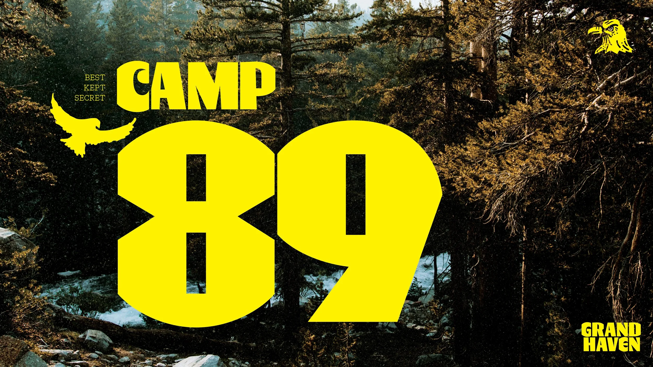
We started with naming, presenting dozens of names and were so excited when the client landed on one of our fav’s—Camp ‘89.
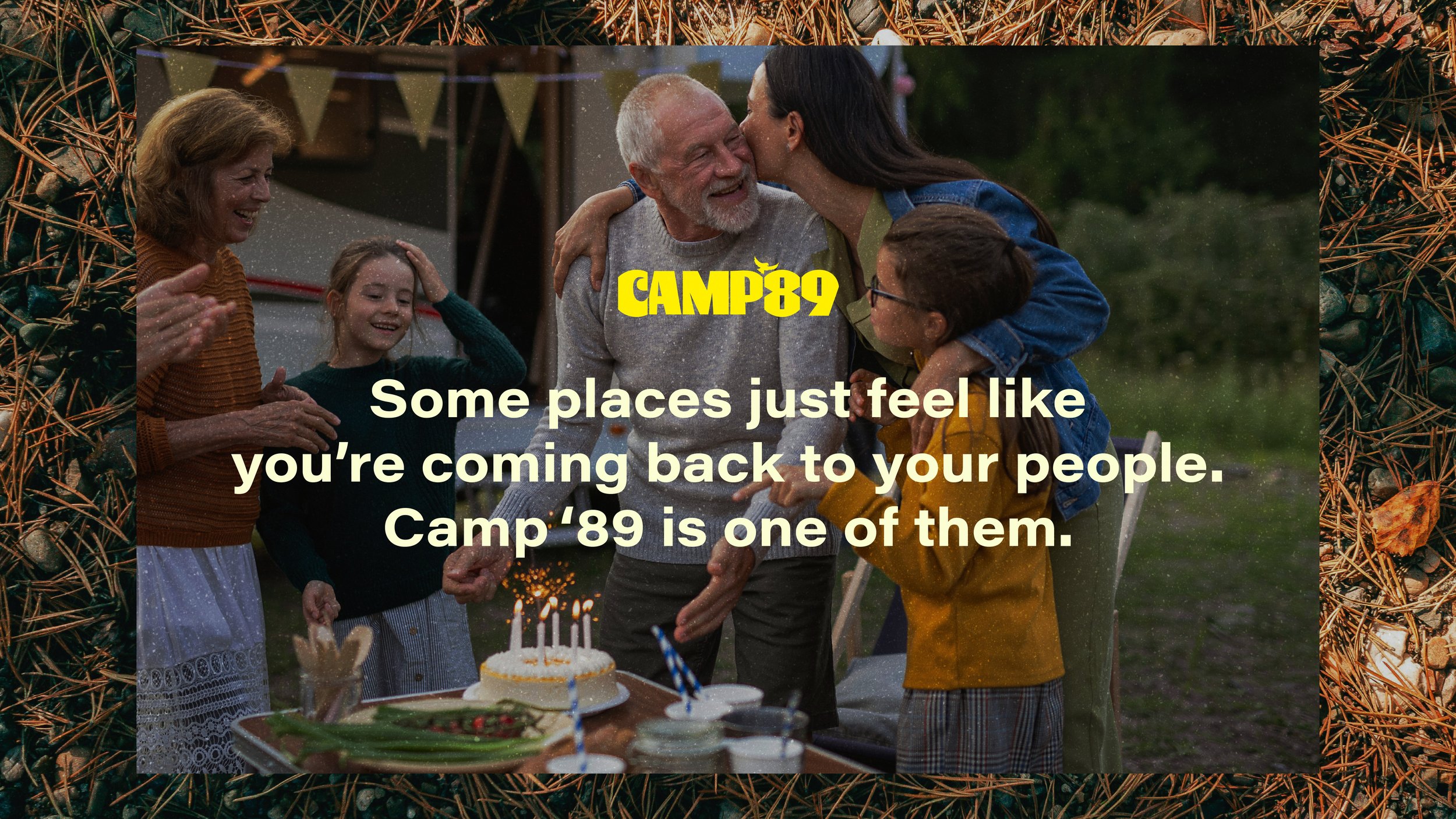
A mix of local history, 80s nostalgia and latch-key kid vibes, Camp ‘89 represents the years 1889 (when the camp’s community of Agnew was founded), and 1989 (when Camp ‘89’s former grounds—the original Yogi Bear Grand Haven Campground—was opened).
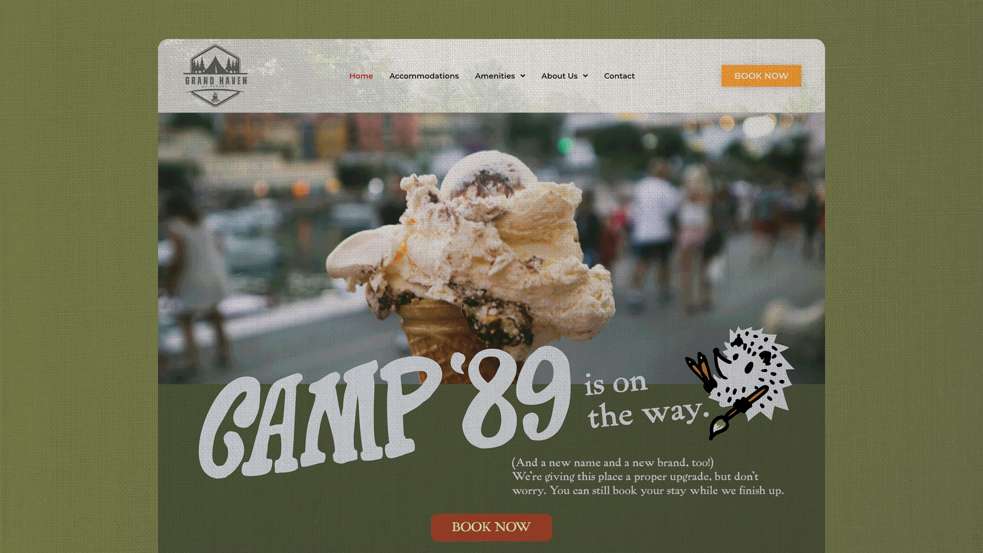
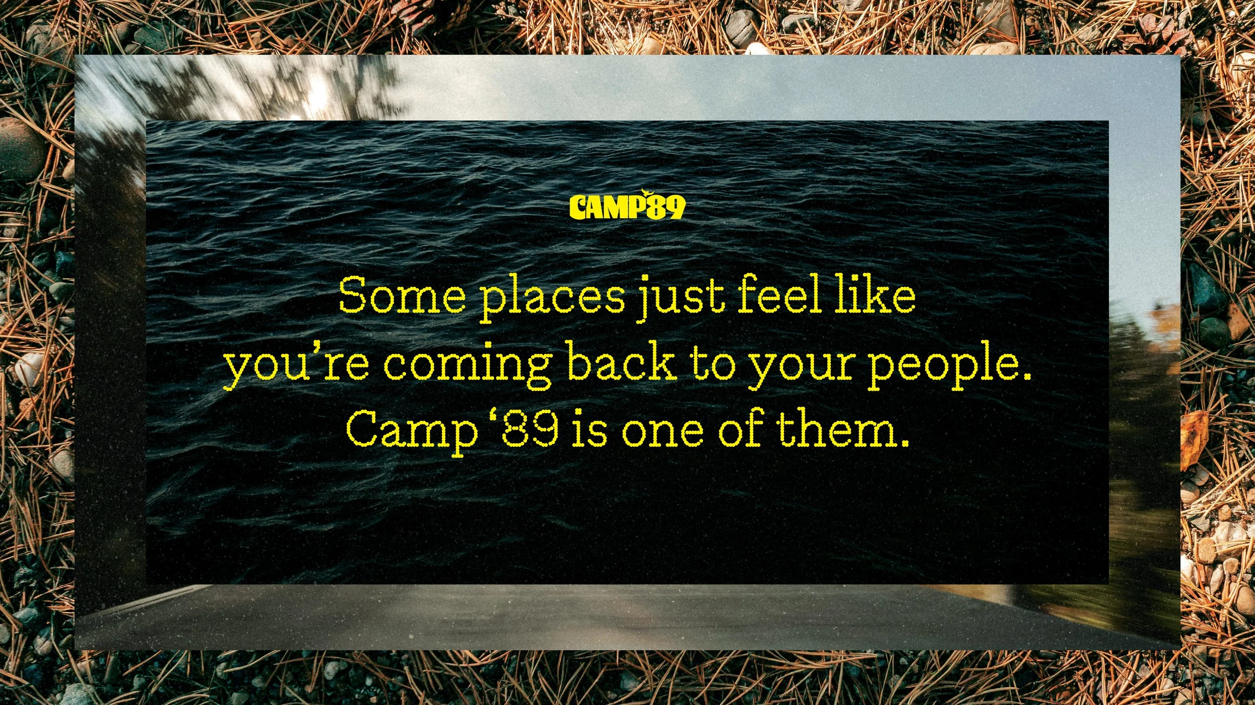
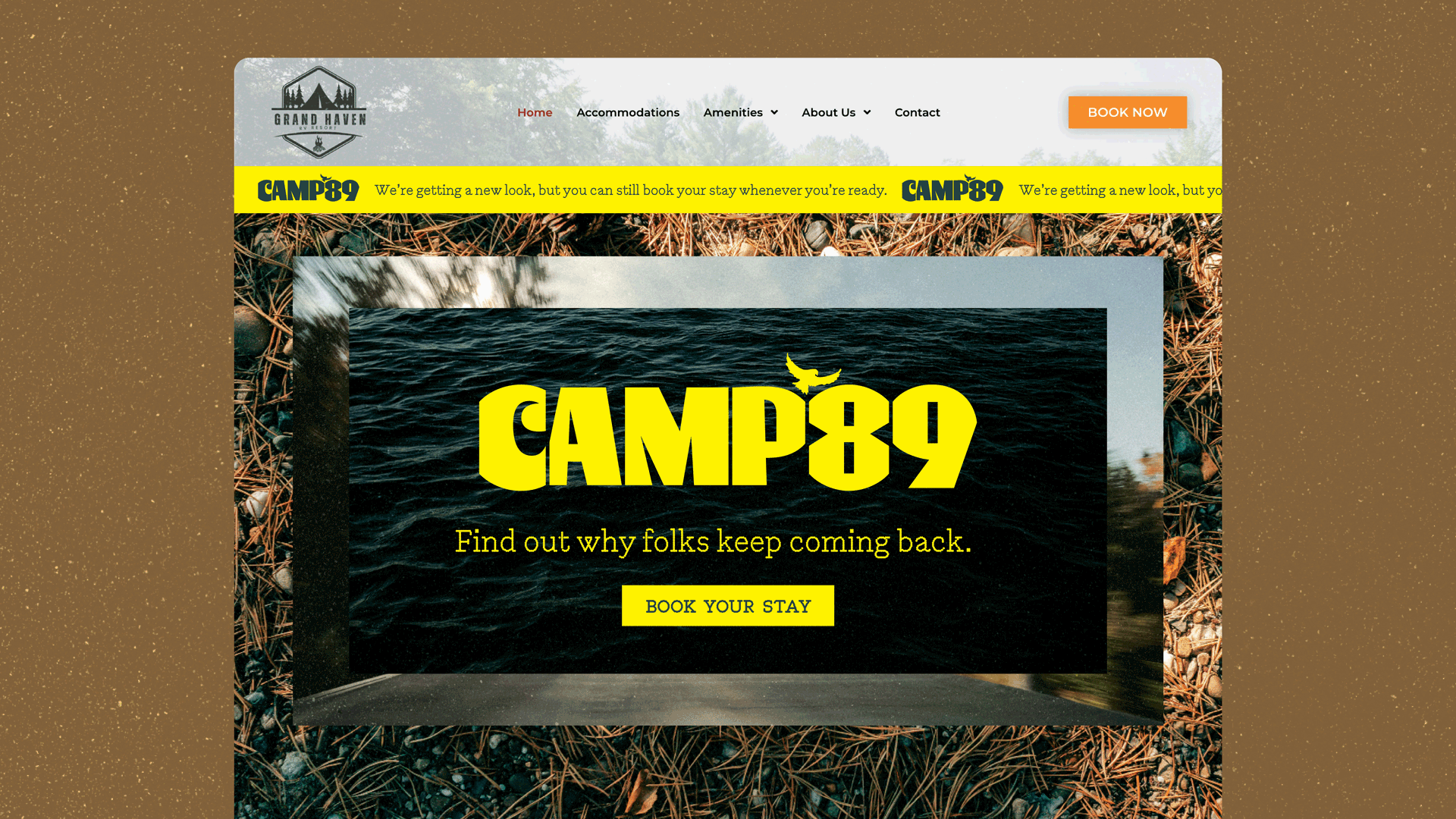
To go with the brand launch, Ben Petersen designed and developed a beautiful new website: Camp89gh.com.
Wanna see more? Here’s a sneak peek at my other concepts.
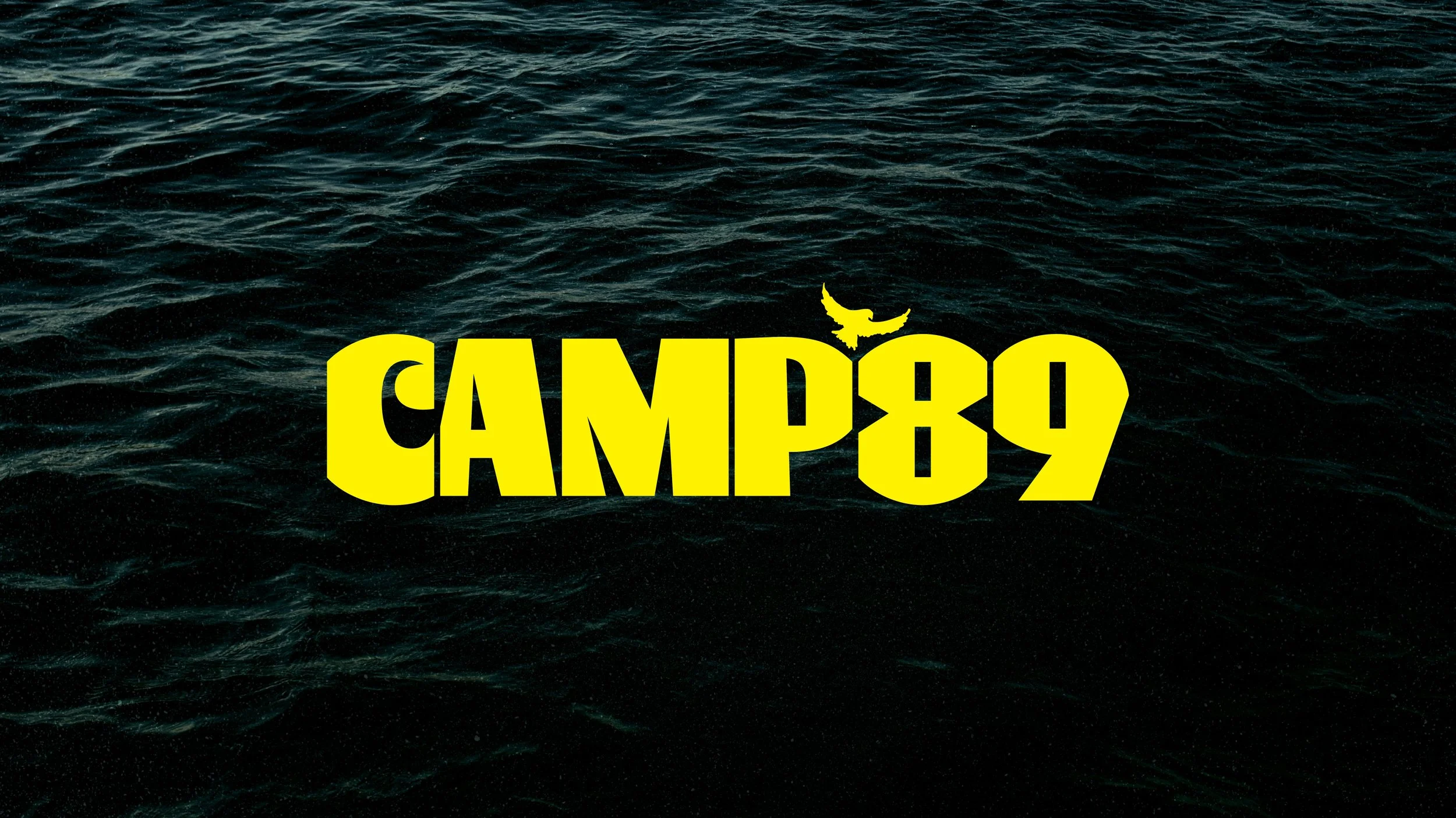
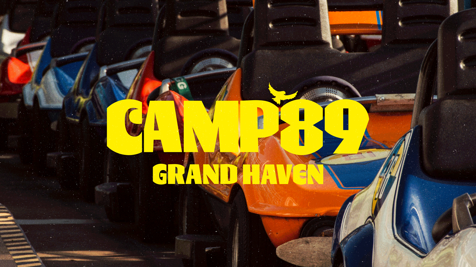
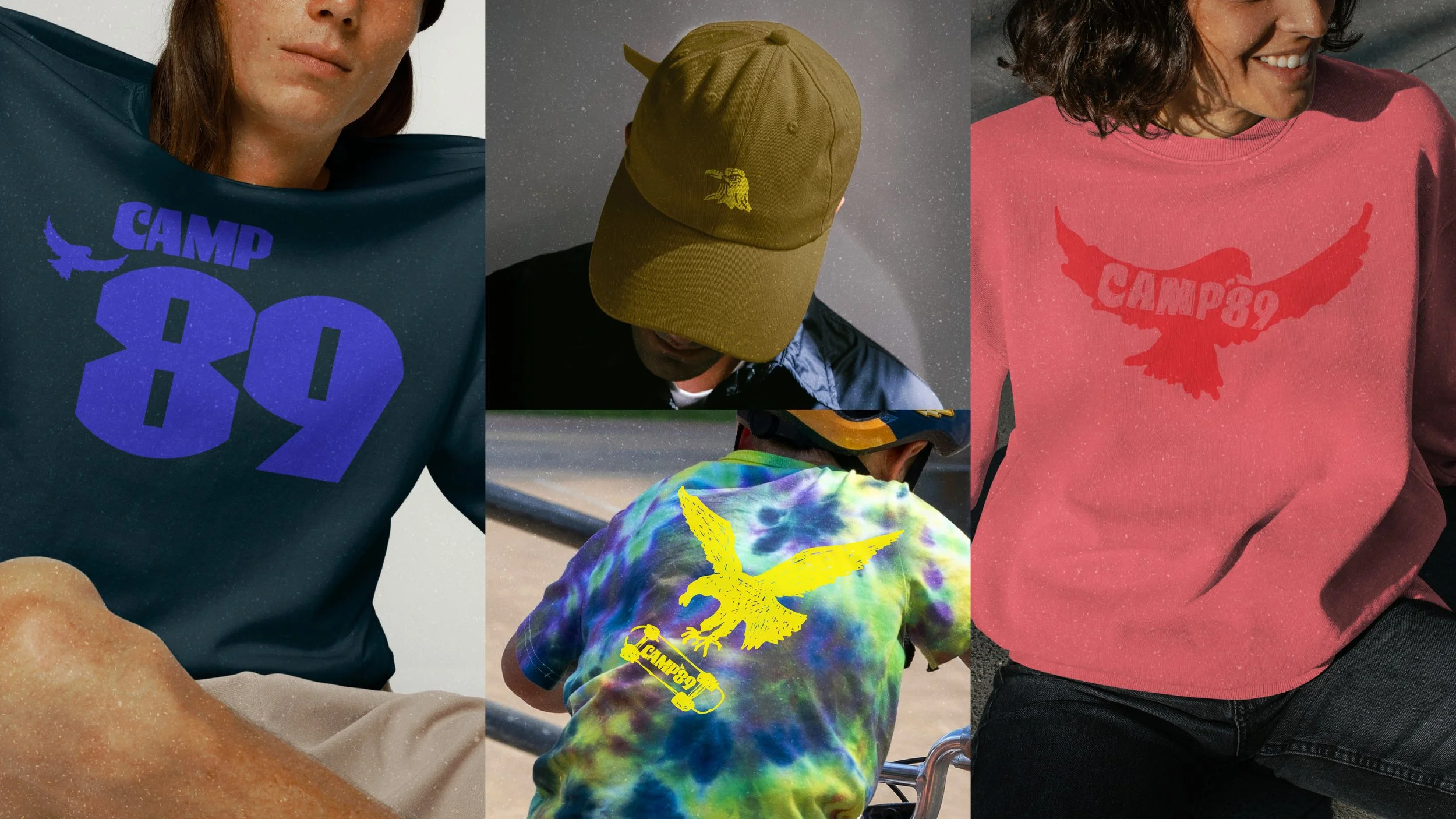
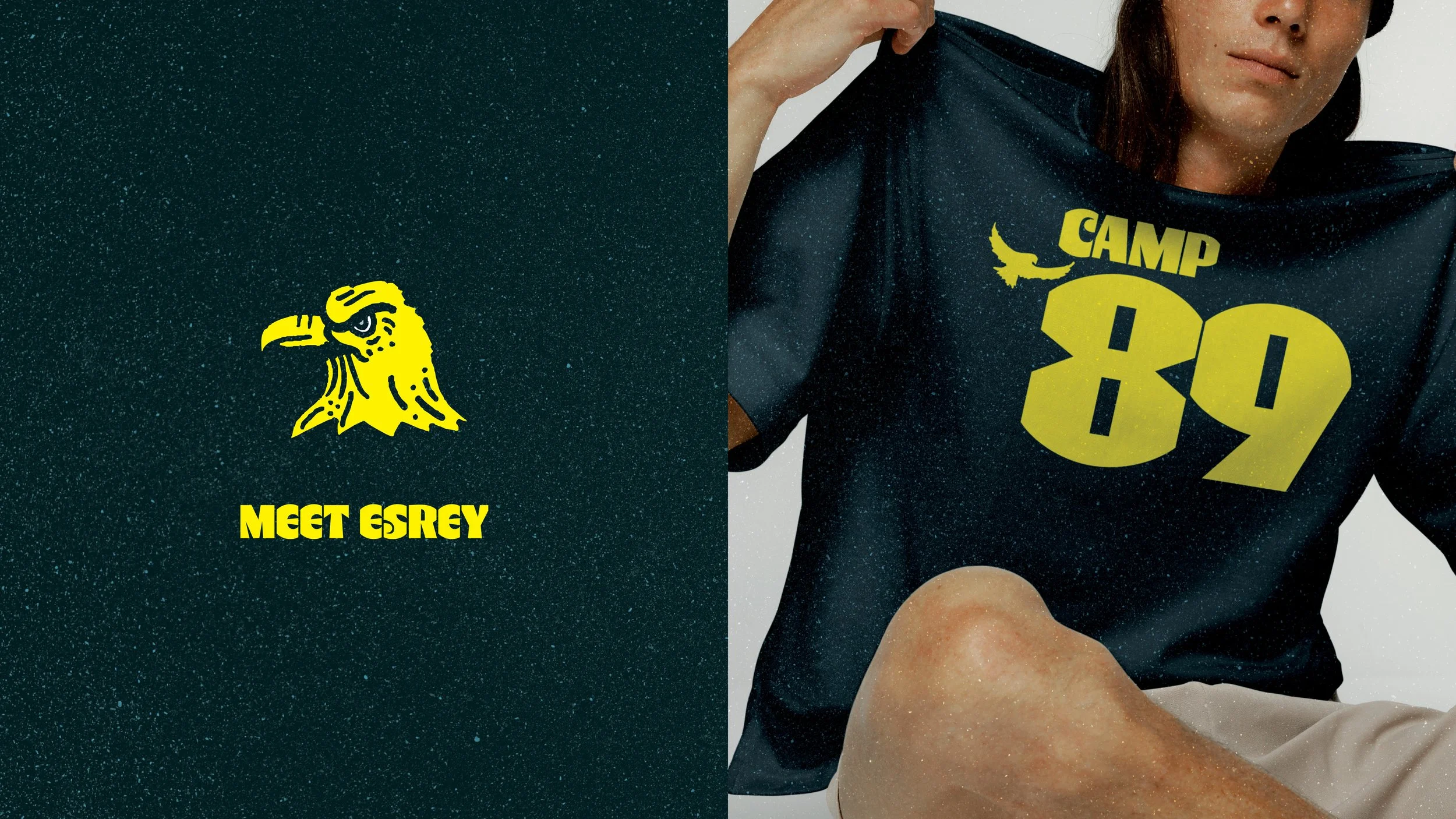
This was the chosen direction before some tweaks were made. The client loved the bright pop of yellow, and the symbol of the eagle to represent a strong, proud character to draw in new campers.
Concept 01: Local Legends
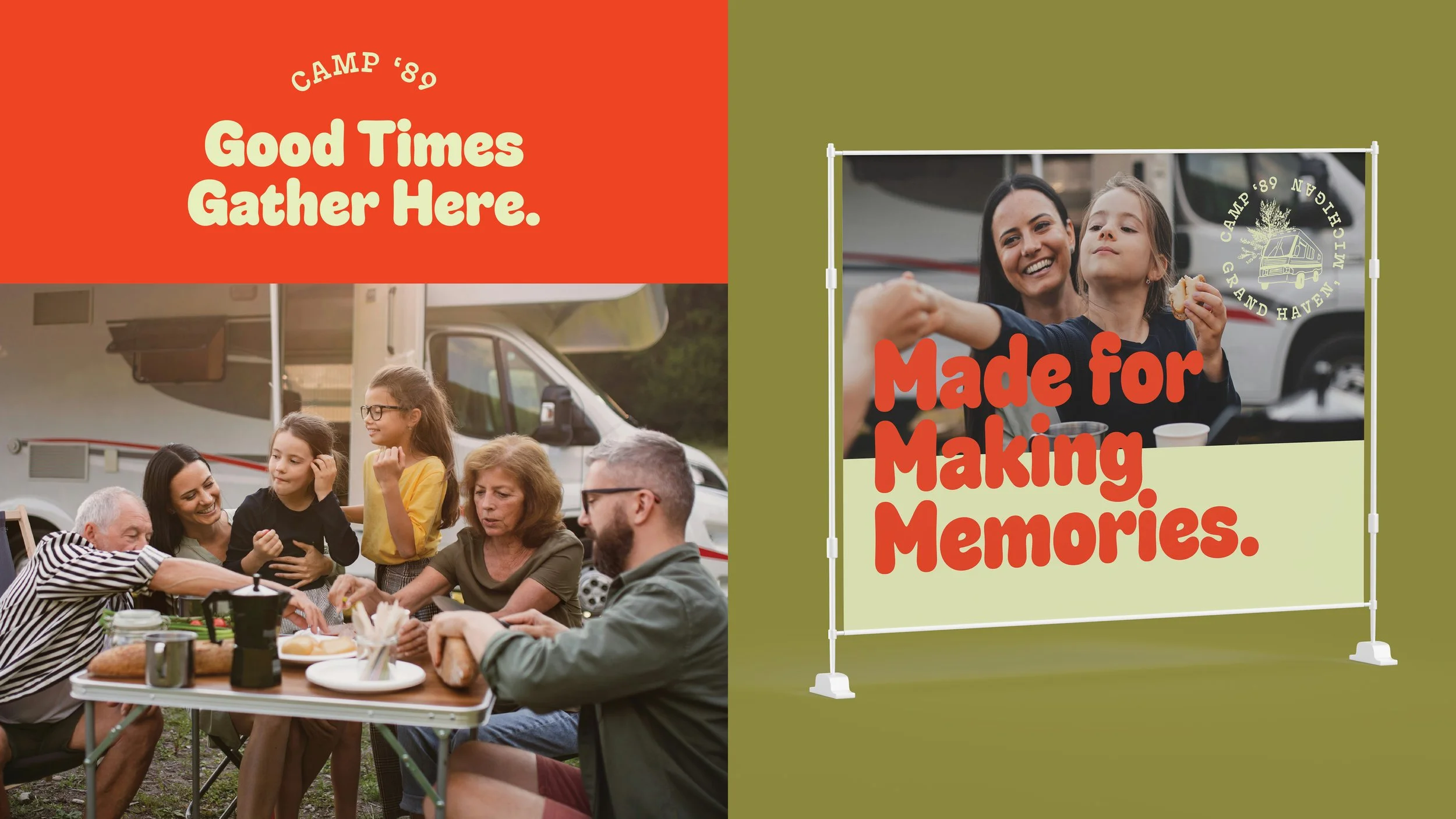
Concept 02: Sunny Side
Playful and bright, this concept encampuses nostalgia and the small, special moments that make camp memorable.

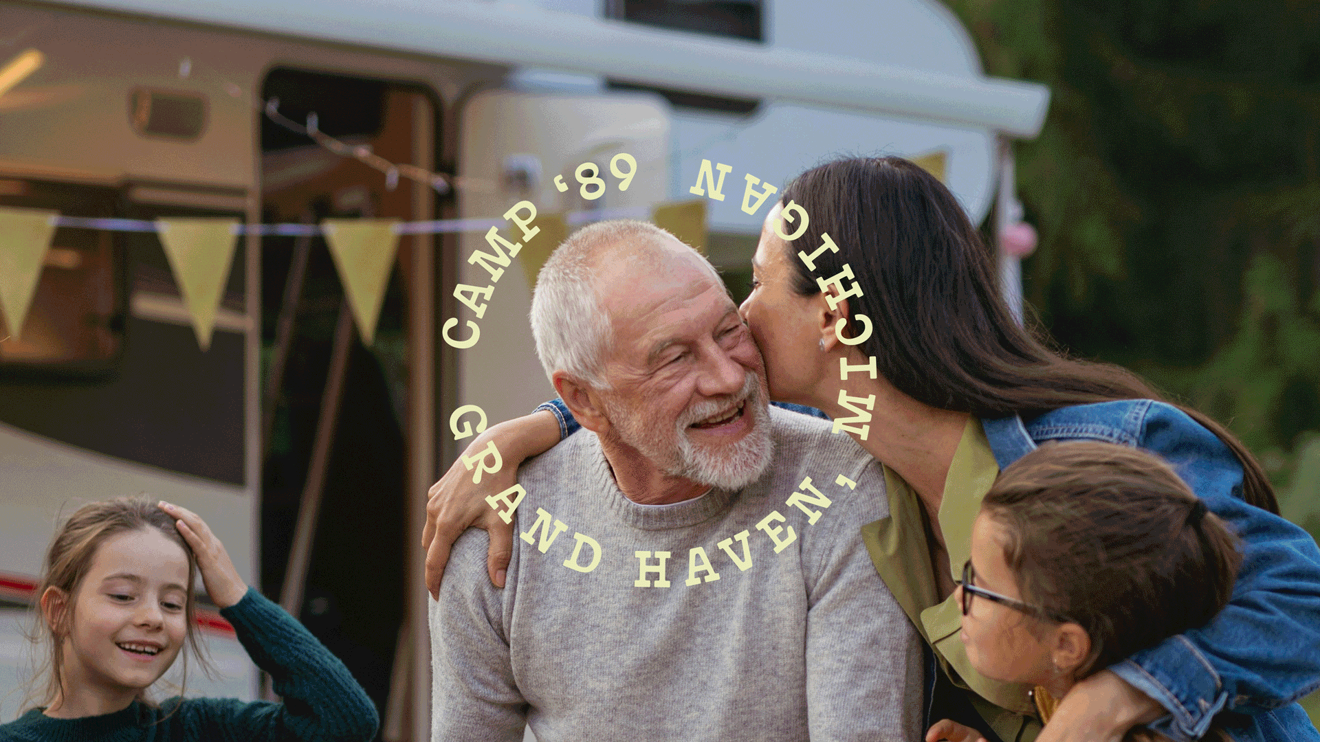

Concept 03: The Camp Range
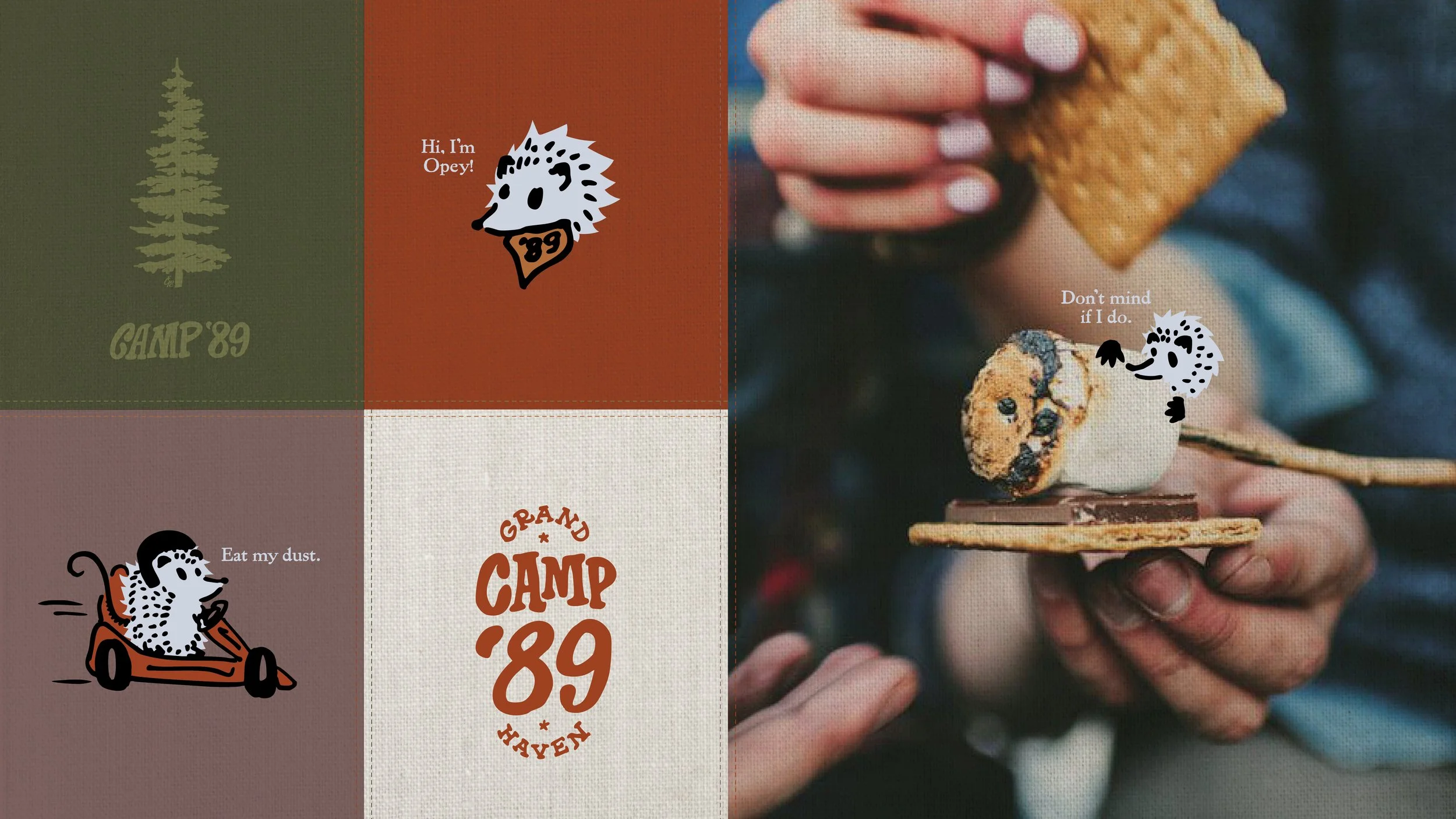
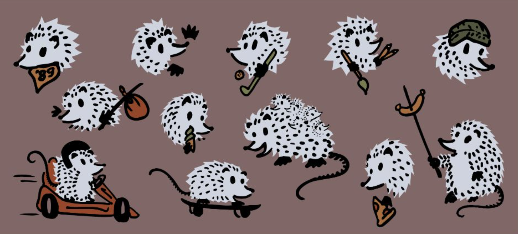
A retro color palette, POV-focused photography, hand-lettered type and Opey—the charming rascal that won us all over.